 The papers ranging from thin white tissue paper to thick white foam core boards, and the only tools for manipulating these are your hand, a thin paint brush, white glue, scissors, and 18 gage wire.
What choices would emerge?
Colorless Emotions: Follow the twists and turns of Deb’s responses to learn the ways that the materials, her documentation, and her peers influenced the direction of her play.
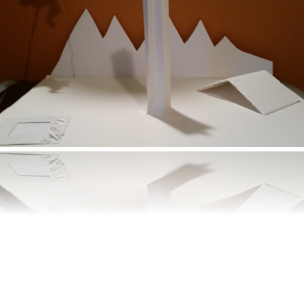
Her first impulses were to cut, and bend, and manipulate. Each shape was imagined as a realistic phenomenon, something she knew in the world. As she folds foam core she sees a tent, and in the tall column she envisions the trunk of a tree. The idea of whiteness led to thoughts of snow covered mountains and a pond made of shiny white paper. She thought, “the shiny paper looks like ice,” and cut up pieces of core board around the pond look like snow covered rocks.
Deb was asked to document each shift in her thinking process with photographs, and to add descriptive text following the play to make her thinking visible. This documentation was then shared with peers whose feedback opened Deb to new insights and unimagined directions for her play.
Peer Responses following play
 Christine: When a child is exploring materials that are monotone, how do we encourage extensions with, say shadows or tones that are slightly different?
Brittany: I loved that you used strictly all white materials. I think with the all white materials you can find a variety of things. I enjoyed that in your photos you could create texture with the paper and see the texture in the shadows. I think that creates an interesting dialog for the creator.
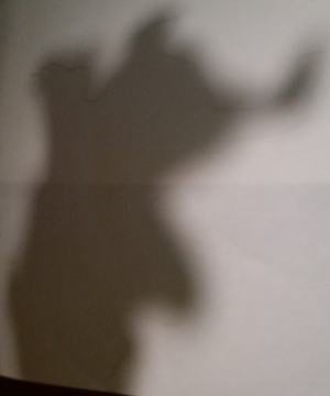
Deb never noticed the shadows and the creations the shadows made until her peers mentioned them during this reflection following the play session.
Deb: My thoughts keep going back to making something, and giving it a name! I truly believe it is easier for children to imagine than adults. I need to look beyond the actuality of the piece. Am I thinking too concretely?
Second play session
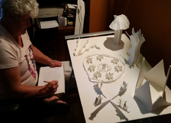
Deb: After hearing the dialogue from my peers I wanted to look at more shadows and what they created more closely … … I deleted my camping theme and started over with a notion of imagination, manipulation, abstract thoughts, and creating with shadows.
Peers thought she might want to think about adding color, which led her to wonder:
“Why do people want me to use color? I am supposed to ‘think white’, not color. Looking at this piece being all white does make it look stark and frigid. Is there an emotion in this piece? Are people biased toward no colors? What do you feel when you look at this piece?”
She wasn’t convinced about adding color.
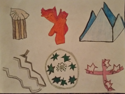
“For my third play session, I decided to draw my creation. The only change in materials was to add colored pencils. One of the many approaches in Reggio is to ask the children to re-represent their creation. As much as I felt this was an impossible task, I tried. I figured, if I asked my children to do this, I should try drawing, too!”
Discovery about drawing and ability
“Capturing shadows was hard to do. I gave up on a single piece of paper, and decided to draw them individually. The only shadow I really liked was the cloud in the first play.”
Taking a risk and following the advice of her peers. Risk taking is part of the creative process, and, children take risks every day in their play experiences.
“One thing I found out about myself is, I CAN draw if I try. I also think color gives the piece more meaning and an emotional attachment. The white seems so sterile and pure, while the colored one is more playful. Color plays on the emotions.”
And …
I wish I would have taken a picture of just the drawing with no color.
A good solution is to keep the original drawing and make a copy for coloring purposes. Investigate the ways that transfer original sketches to their canvases or quality art papers using a grid method tracing paper and pencil.
Searching for new meaning: Researching the relationship between color and emotions
“The title, “Colorless Emotions” was an important part of this play. After trying hard to think abstract, I became more emotionally involved in each piece. I was trying through an adult’s eyes to view more through a child’s eye.”
Based on the relationship between the colors in her process Deb wanted to see what she could find about the relationship between color and emotions.
- Red – energy/aggression

- Blue – trust/coldness
- Yellow – creativity/depression
- Green – rest/stagnation
- Violet – spiritual/suppression
- Orange – security/frustration
- Black – security/heaviness
- White – simplicity/unfriendliness
Reference for Chart:
Wright, A., (2008-15). Colour Affects. Received from www.color-affects.do.uk/psychological-properties-of-colours
Posted by Jane Broderick – Based on our facilitation of materials explorations


